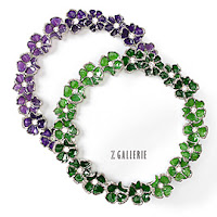
Go ahead, try something new. (Most of the time), easier said than done. Like a lot of people, I do not often try new foods, colors, hairstyles. I order the same familiar dishes from the same favorite restaurants, stick to colors I know look good on me. Hard to do yet worth the try. I used to hate the color purple, until somebody told me it looked good on me. I tried it on, surprised myself and now I love it in its many different incarnations. It's hard to embrace certain types of changes but sometimes when you do, you wonder why you even hesitated at all.
So for those willing to embrace a change, here are some of the design trend predictions for 2011.
For 2011,
Pantone has chosen 'Honeysuckle' as its color of the year. The color is bright without being bold; reflecting a brighter outlook on the future, but not an ebulient one.
See what I mean? Last year when Pantone laid out a Mediterranean-y turquoise, that was not hard to imagine on a wall or a pillow. This pink however, is pretty hard to conceive on a whole of other things besides a little girl's room or an item out of a Breast Cancer Awareness campaign.
Certainly this one is something you may want to take in small doses. A pot of orchids, an ottoman, a lamp. My best challenge? The ceiling or one wall in a powder room. This pink, like a delightful pot of rouge, will warm and complement skin color and makes everyone look pretty in the mirror!
Below: Lamp from www.lampsplus.com
The recession has diminished our need for non-essentials and that will be seen in the simple, geometric design of furniture. Flourishes will not be noticeable with the eyes, but with the comfort of a chair
that looks austere in a geometric form, but is really quite comfortable.
Below: Soren Chair, www.roomandboard.com


